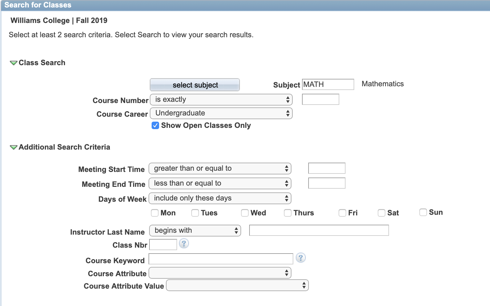
An aspect of Williams PeopleSoft that all Williams students inevitably have to deal with is the class sign-up section. Part of what I think is bad about this design is that it presents more options than most students actually need while also presenting them in an unappealing way. Under the additional search criteria section, there are options for students to search by Meeting Start Times that are greater than, greater than or equal to, between, exactly, less than or equal to, or less than a given time with the same holding true for Meeting End Times. There is also an option to search by Instructor Last Name which allows the student to input the exact last name, letters contained in the name, or what the last name begins with. All of these options lead to students typically just entering their subject, which is selected from an entirely different menu, and navigating down to whatever course they previously scouted from the far superior Williams course catalog.