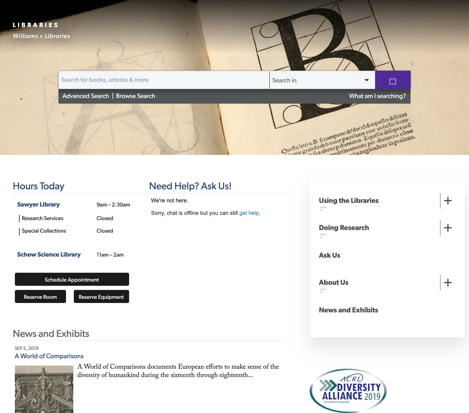
The Williams College website as a whole is fairly well-designed. I’d like to give special recognition to the library section of the website though as it gives the user everything they need in a clean, well-presented manner. Two of the most common questions people have in regards to the library is whether or not it is open, and whether or not the library has the book they need. The moment a user clicks into this section, those two questions are given easy answers through an immediately apparent indicator of the library’s hours and through a search bar that allows users to search for books at Williams. The navigation menu then gives additional information depending on if the user is interested in doing research or if they would like to learn more about the various aspects and rules of the library. All of this is very pleasing to the eye while not inundating the user with information that they are not specifically searching for.