My first encounter with HCI concepts was during Winter Study 2019 when I took a Design Thinking course with Ric Grefe, Williams’ Design Thinker in Residence, that involved visiting an IBM Design Studio and utilizing various design methods such as conducting interviews, creating personas, and drawing storyboards to create a unique solution for our given problem. Before that experience, I was a “the more features there are, the better” type of designer thinking that as long as the final design worked without any major bugs, users would be happier with a plethora of different options and features that they can make use of. To that effect, when thinking of designs, I would add whatever features I had seen before that I thought were cool simply for the fun of it. I was essentially designing for myself only. However, that course encouraged me to seek out the user to find out what they need and what they find essential and making those ideas a core part of my designs. These new thoughts pushed me to take CSCI 432: Human-Computer Interaction to learn more about some of the concepts I had been introduced to in my earlier course. Now this really opened my eyes and made me consider the biases that can take hold in a design when the user is not considered. If you design only for yourself or your team, there are a whole slew of ethical and accessibility questions that often go ignored or unnoticed throughout the design process. Here are some of the issues I found with designing with your idea of what’s cool or necessary in mind:
Cool isn’t always accessible
Too often, users with impairments such as sensory issues, dyslexia, autism, and many other prevalent disabilities have to deal with designs that they either struggle to use or are completely incapable of using because design teams neglected to include people with said disabilities in the design process. This point was especially relevant in the designing of hikAR as, similarly, we were unable to include the voices of people with disabilities due to the constraints of designing within a college course. This came up in an interesting way with the design of our app and website. Considering our focus on nature and hiking, one might think that our design would make heavy usage of the color green since that is the color people commonly associate with nature. However, we discovered in one of our lessons that 1 in 12 males are color blind with red-green color-blindness being the most common. So what might have been a cool or logical design choice for us came with some trade-offs that I may not have fully considered if it was not pointed out explicitly. That’s also without mentioning my extremely non-descriptive alt-text prior to learning about the use of that as I had never used a speech-to-text system before. Thus, my personal website had pictures in an attempt to pretty up the look of it with none of those pictures being accessible for people with visual impairments. This goes to show the importance of having someone with disabilities to, at minimum, test your design to ensure that the designer’s idea of cool remains accessible for as many users as possible.
Cool isn’t enough to answer ethical questions
Honestly, prior to this course, I didn’t deeply consider too many ethical questions as most of my designs were limited to small labs for my courses. However, working with human-centered design methods and hearing about how some design patterns, dubbed “Dark Patterns”, are manipulated to mislead and trick users into either making purchases or otherwise doing something that they did not explicitly wish to do, caused me to seriously consider my own ethics when it comes to designing and, although unrelated to the dark patterns point, how personal and institutional biases can affect different designs. For that last point, the most vivid illustration of this is MIT’s Moral Machine which has the user go through a number of scenarios involving a self-driving car and whether the car should crash and kill its passengers or hit people at a crosswalk. On a surface level, these are very important questions for self-driving vehicles and they are ones that will, by their very nature, be biased by the people designing the vehicles. On a slightly deeper level, this clearly applies to any designs created by people although perhaps not on the scale of life-or-death. Any design decisions we make are inherently clouded by our own biases and prejudice and we knowingly or unknowingly can harm people of certain genders or races through those choices if we don’t remain aware of how our biases bleed into our designs.
Your Cool is not the user’s Cool
At its core, what this point encapsulates is the essential idea that the designer is not the user. This seems evident and simple, but it is very easy to get caught up in the flow of your design and to start implementing a ton of different features and ideas that you want to see in your design. However, it is necessary to always remain grounded and recognize that even if you are a member of the target audience you are designing for, you are only one member of that demographic. It is necessary to reach out to other users to get a sense for their needs and wants rather than solely focusing on yours. This ensures a flow of new ideas and is essential for creating new, innovative designs that actually meet the user’s needs and will be used by them. Otherwise, a lot of time can be spent designing something that does nothing to solve the user’s core issues and is ultimately unappealing to the user.
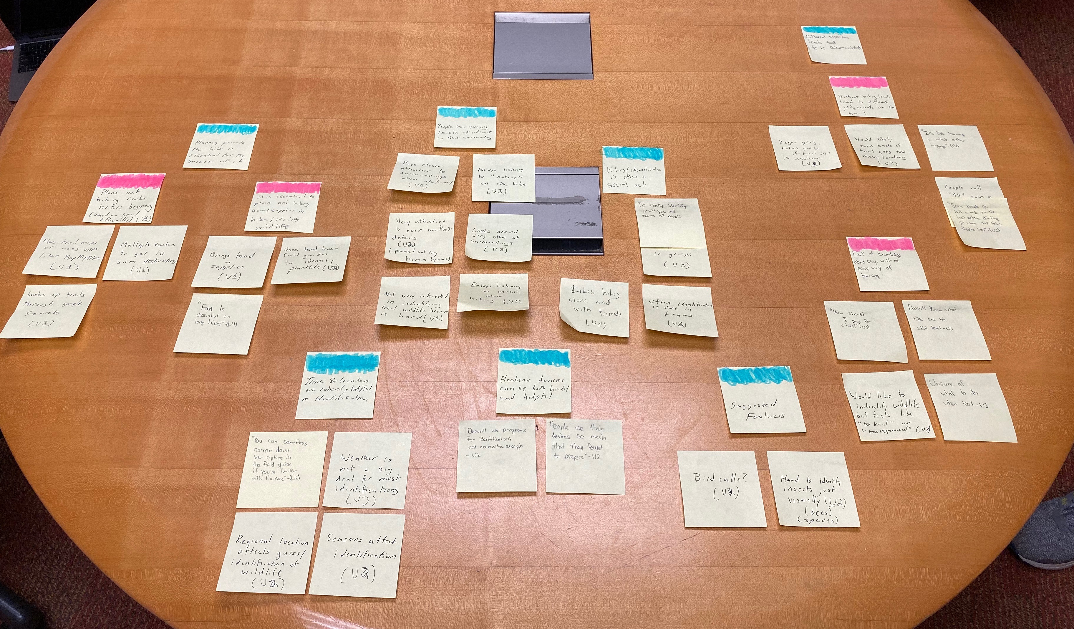
Cool isn’t always creative or new
What I think of as cool is often influenced in large part by things that I’ve seen in other designs that I liked. However, as a designer, it is important to try and think of new optimal solutions for the problems that users have. Without that key aspect, designers would just be constantly repeating and reusing the exact same designs from before without ever breaking new ground and we would never actually advance in any meaningful way. Thus, in order to create new and interesting designs, I found that I first needed to let go of my preconceived notions of how things should be done and dig deep into contextual inquiries, interviews, and other forms of information from potential users to truly understand the problem to try and create a unique solution rather than creating a solution that has a lot of cool features, but only solves the problem on a surface-level or doesn’t improve the user’s life or experience in any significant way. This lesson was driven home by the contextual inquiries I conducted as part of hikAR. Here is the affinity diagram that holds some of the bigger insights we made with the help of our contextual inquiries:
Cool isn’t always simple
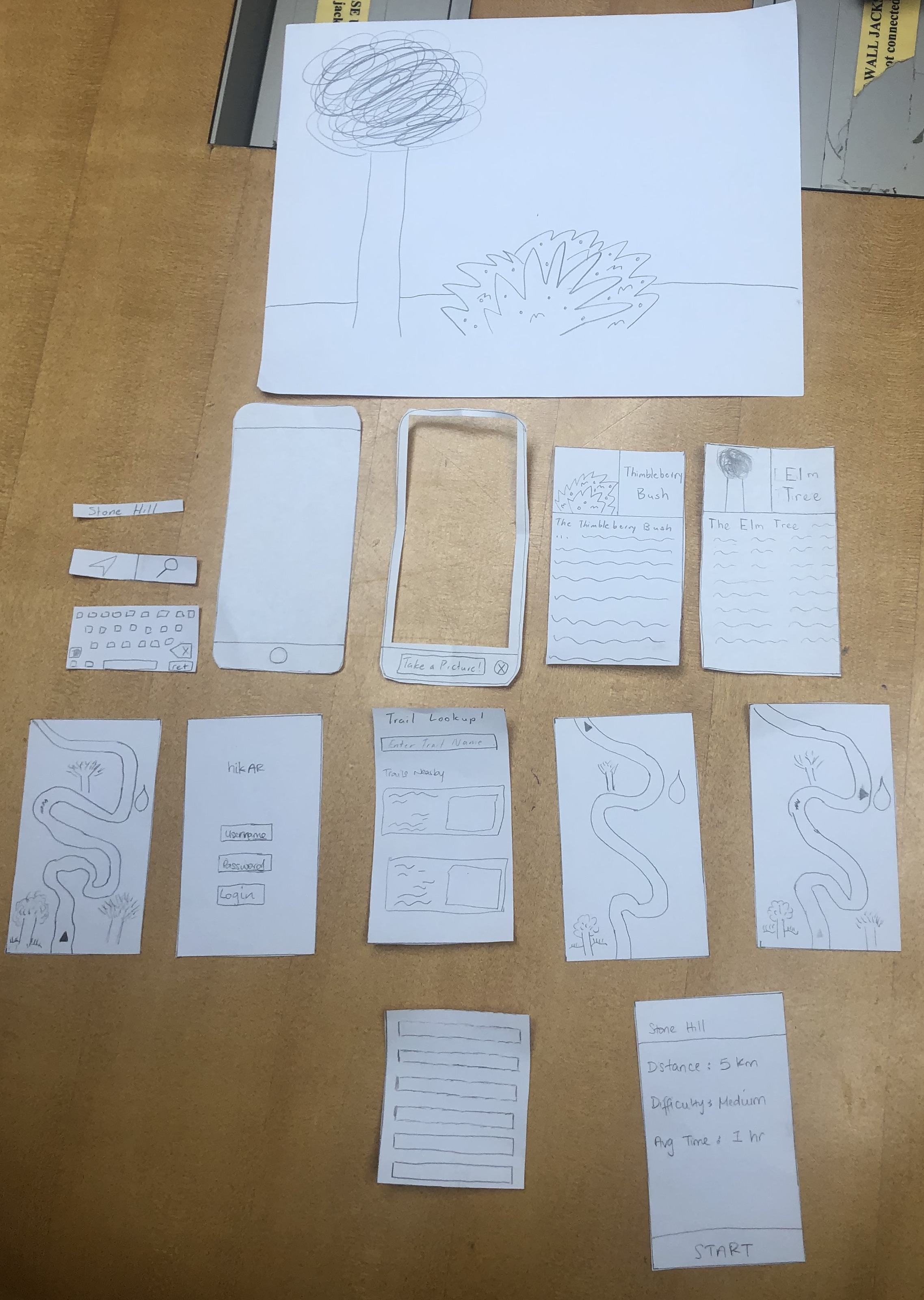
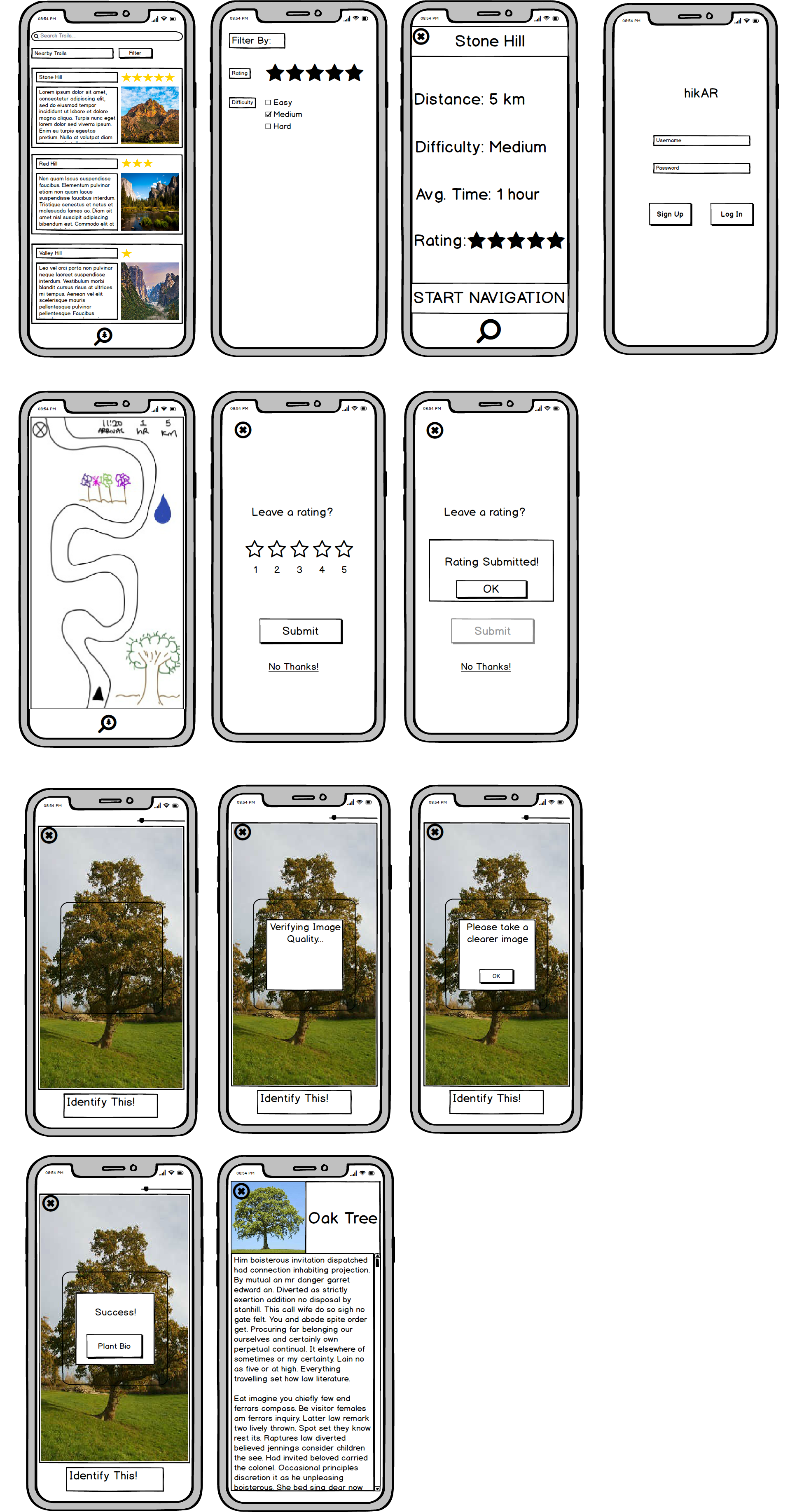
At the end of the day, a designer should aim to create a design that can be easily understood by users. We all probably know somebody who opens up a new product or device, takes one look at the instruction manual, and immediately throws it out. I’m slightly ashamed to admit that I am exactly that type of person. Thankfully, I have been spoiled by relatively intuitive designs that allowed for me to easily figure out how to use the designs. This is something that every designer should strive for and it’s something that I learned firsthand through the usability tests conducted by the hikAR team. You can see through the difference between our initial paper prototype and our digital mockups that a few pieces of our design needed to be simplified to ensure that all users would be able to easily make use of our design.
This is something that will definitely influence any future designs that I participate in as it also connects to the idea of accessibility and creating designs that are accessible for all users regardless of their circumstances.